How to Build a Toolbar Component in Angular for beginners
Using ng-content, *ngFor and @Input()
Introduction
Today I'm going to go through a step-by-step guide on how to add a toolbar component for your angular app. Toolbars are found on many sites and applications throughout the web so it's important to understand how to put together a basic toolbar.
To do this, we will use the Angular CLI to create a new component and also use native Angular features like @Input() and ng-content. Understanding these features will stand you in good stead when using Angular for future projects.
For this article, I'm going to assume you have already created a new Angular project and are ready to create your new component.
Creating a component in Angular
Firstly, to create a new component using Angular's CLI just run this command in the root of your project in the terminal.
ng generate component toolbar
As a side note if you want to create the component and put it inside a folder called 'components' then you can run this command instead.
ng generate component components/toolbar
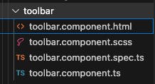
This will generate all the files for you for your new component and is far quicker than doing this manually.
With that done you should have a file structure that looks like this:

Next, we will update the .html file to look like this.
<nav>
  <h1>{{title}}</h1>
</nav>
Then add the following @Input between the constructor and the class declaration as follows.
export class ToolbarComponent implements OnInit {
  @Input('title') title: any;

  constructor() { }
}
With this, we can now pass use @Input within our toolbar component and pass in a title to it like this.
<app-toolbar [title]="toolbar-project"></app-toolbar>
Adding links
Most toolbars on modern websites and apps will have links to other parts of the site or to elsewhere. Now we could just put these into our toolbar component itself but I think this is a good opportunity to show how ng-content works. ng-content allows us to pass elements straight into a child component from the parent component.
Firstly we will make the following changes in our parent component.
<app-toolbar [title]="toolbar-project">
<ul>
    <a [href]="https://www.google.com/" target="_blank">
  Google
</a>
<a [href]="https://www.youtube.com/" target="_blank">
  Youtube
</a>
<a [href]="https://www.bbc.co.uk/" target="_blank">
  BBC
</a>
</ul>
</app-toolbar>
This is just using dummy data of course so feel free to update with actual links in your app or website.
We can now make these links appear within our toolbar component like this.
<nav>
  <h1 class="light-shade">{{title}}</h1>
  <ng-content></ng-content>
</nav>
The ng-content ensures that the elements get passed into our toolbar component as they are.
Refactoring using *ngFor
Refactoring is an important part of coding and means we should always be looking for ways to clean it up and make sure we're not repeating ourselves.
To that end, we're going to refactor our parent component first. To do this we're going to use another Angular directive called *ngFor which allows us to loop through arrays and return html elements for each element of the array.
To do this we first need to create an array in the .ts file of the parent component like so.
@Component({
  selector: 'app-root',
  templateUrl: './app.component.html',
  styleUrls: ['./app.component.scss']
})
export class AppComponent {

  links = [
    {
      name: 'Google',
      url: 'https://www.google.com/',
    },
    {
      name: 'Youtube',
      url: 'https://www.youtube.com/',
    },
    {
      name: 'BBC',
      url: 'https://www.bbc.co.uk/',
    }
  ]
We can then loop through this array in the HTML file like this.
<app-toolbar [title]="toolbar-project">
<ul>
    <a *ngFor="let link of links" [href]="link.url" target="_blank">
  {{link.name}}
</a>
</ul>
</app-toolbar>
This will loops through the array and provide an anchor tag for each with its respective URL and name property.
Lastly, let's add some styles to the toolbar.
Styles
Simply add this to the scss file of the toolbar.
nav {
  display: flex;
  justify-content: space-between;
}
Then in the scss file of your parent component add this code.
ul {
  display: flex;
  justify-content: space-between;
  width: 300px;
  a {
  text-decoration: none;
}
a:hover {
  text-decoration: underline;
}
}
Conclusion and Next Steps
We now have a basic toolbar component for our app or website that allows us to populate it with links or routes to navigate around our app. But this is only the start and there are lots of things you could add to the component. Here are some suggestions:
Make the toolbar responsive and display a mobile-friendly drop-down list instead of all the links individually.
Add more styling to it to make it your own. Consider using a color picker like Colormind to set a unified theme for all your components.
Instead of using names for each link, try adding logos instead. FontAwesome is a good resource for this.
Creating components and using Angular directives are cornerstones of using the Angular framework. As you'll be using them often, you'll get plenty of practice with them and get proficient in no time.
Happy coding!

